Whether you’re trying to improve your social media game with attractive graphics or design your own wedding invitations, a basic understanding of graphic design can be used in a multitude of ways.
That said, good graphic design is deceptively difficult. If you’ve tried to design something on your own, you’ve likely found that it’s not as easy as you might have thought.
With a few graphic design tips, however, you can get started creating beautiful designs in no time. Outlined below is the ultimate graphic design guide for beginners, including tips and tricks for navigating the design process. Let’s get started!
1. Don’t Be Afraid of White Space
When you’re getting started with graphic design, it can feel counterintuitive to use a less is more approach. But in reality, white space is essential for achieving a professional-looking design.
White, or negative, space can help create a clean, contemporary design. And even if you’re not going for a minimalistic design, you should still leave some open space.
This is because white space is an excellent way to create a focal point in your design. Leave space around important text boxes and other graphic elements to draw attention to them.
2. Be Careful with Fonts
Fonts are a fantastic design tool and can be great fun to play around with, however, you have to be careful when choosing fonts for your design. One of the most important graphic design pointers to remember is that fonts are powerful!
When in doubt, keep your fonts simple and easy to read. You should also limit yourself to a maximum of two different fonts, especially when you’re first starting out.
Using too many fonts can make your design feel busy and cluttered. Not to mention, certain fonts simply don’t look good together, and sometimes it can be hard to tell.
3. Create a Mood Board
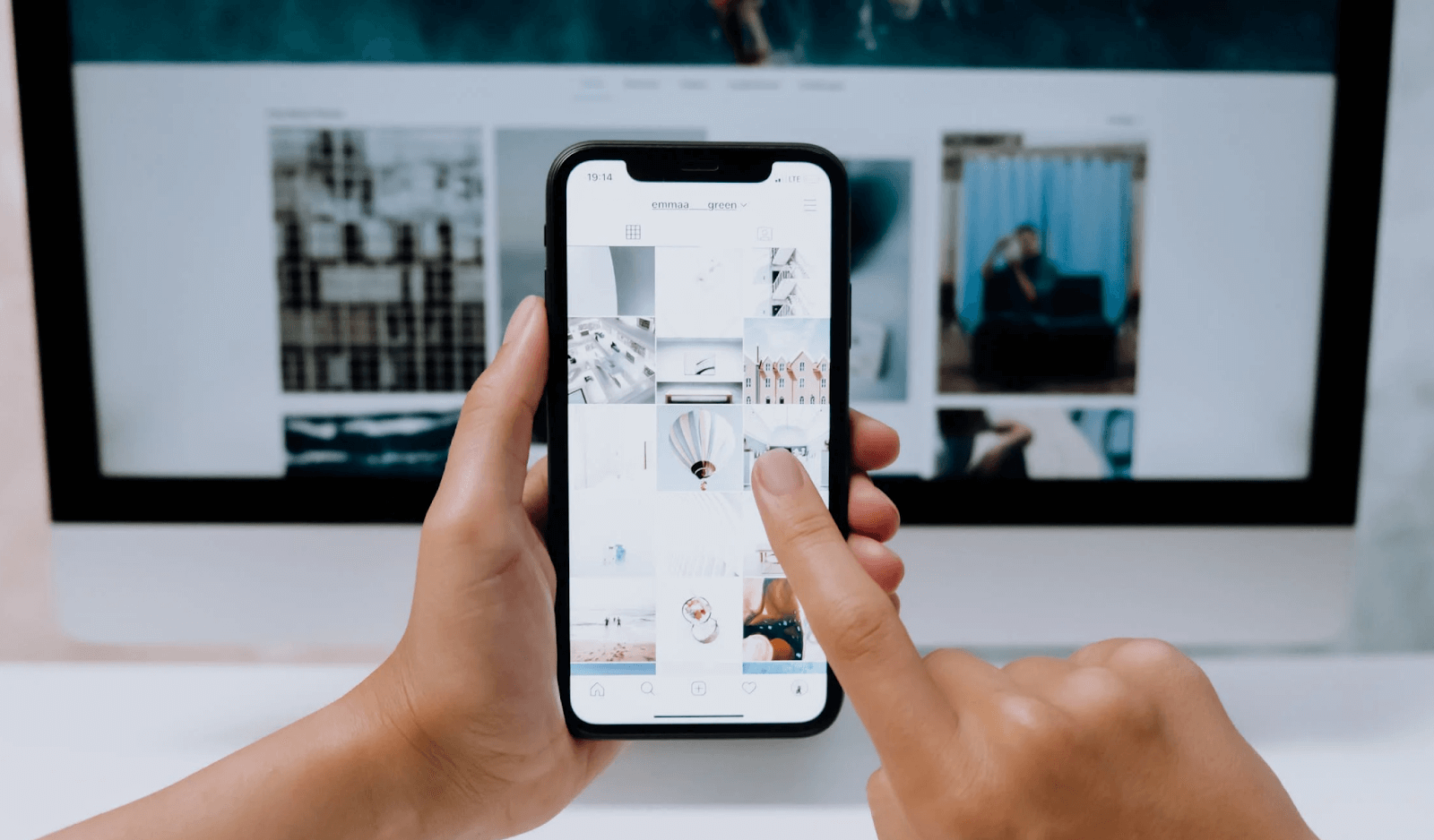
Nothing gets creative juices flowing like a mood board. It’s simple to do – just collect images, color swatches, and other inspiration and arrange them all in a grid or collage. You can use this to find a color palette or even an initial direction for your design.
You have a couple of options when it comes to creating a mood board. You could take the old fashioned route and cut images from magazines to put together an inspirational collage. Or you could make a digital mood board, either online or in an app on your computer.
If you do decide to create a digital mood board, it’s a good idea to know how to save pdf as jpeg and other conversion methods so that you can keep everything in one file.
4. Take a Break and Come Back
Sometimes the best thing you can do is to take a break. If you’ve been staring at your screen for hours and can’t seem to get your design to look the way you want it, get up and step away for half an hour or so.
When you’re taking a break, try to do things that boost energy and creativity. This will vary depending on your personality and interests, but some good activities include taking a walk, meditating, or making yourself a meal.
You’ll be amazed by how much different you feel and how different your design looks once you’ve taken a break from staring at it.
5. Be Smart With Colors
Believe it or not, colors aren’t just nice to look at, they can also go a long way in communicating tone. The trick with color is to not let your palette become too busy. Stick with 1 to 3 complimentary but contrasting colors.
Keep in mind that each color has a volume, and you want to have a variety of volumes in your design. Not every color should be loud and in your face, and not every color should be subtle.
Every color also inspires an emotion. Familiarize yourself with the psychology of color before beginning your design to ensure that the colors you’re choosing are conveying the correct message to your audience.
6. Play With Scale
Scale is one of the most important elements of graphic design, as it helps to establish hierarchy and create intrigue. Hierarchy is organizing elements of your design according to their importance. The elements that you want people to notice first should be the largest and most eye-catching.
Regardless of how intricate your design or how many elements you use, the most important piece or message of your design should be dominant.
7. Practice Makes Perfect
As with any skill, the key to honing your graphic design skills is practice. There are going to be moments, whether you’re a beginner or a design expert, when you get frustrated and want to quit. But one of the best things you can do to learn and improve is to make mistakes.
The great thing about graphic design is that it’s all digital. Don’t like the last stroke you made or the font you chose? All you have to do is hit the undo button and try again.
Use These Graphic Design Tips to Improve Your Skill
Graphic design can be overwhelming when you open that first blank document to get started. But with a little practice and a few great graphic design tips, you’ll be on your way to creating stunning designs with ease.
Remember, if you’re feeling stuck with your design, the best thing you can do is take a break and walk away. Looking at it with fresh eyes might be exactly what you need to reach a breakthrough!
Interested in learning more about graphic design? Take a look at our blog!


